
Microsoft has released a new deep dive into Power BI's conditional formatting for lines and legends, helping report authors create more dynamic and visually meaningful charts. The guide explores practical techniques for using gradients, rules, and field-driven colours to make reports easier to interpret and maintain.
Here's what you need to know:
What is Conditional Formatting?
Conditional formatting lets you dynamically control colours and other visual properties using rules, gradients, or field values. It also supports visual calculations, making it easier to create flexible, data-driven reports without constant manual updates.
Where Can You Use It?
Conditional formatting now supports lines, legends, markers, and line segments across more chart types, including line, area, bar, column, combo, pie, donut, and funnel charts. This gives you greater control over how important insights are highlighted while keeping report designs consistent.
Use Case #1: Highlight the Latest Year
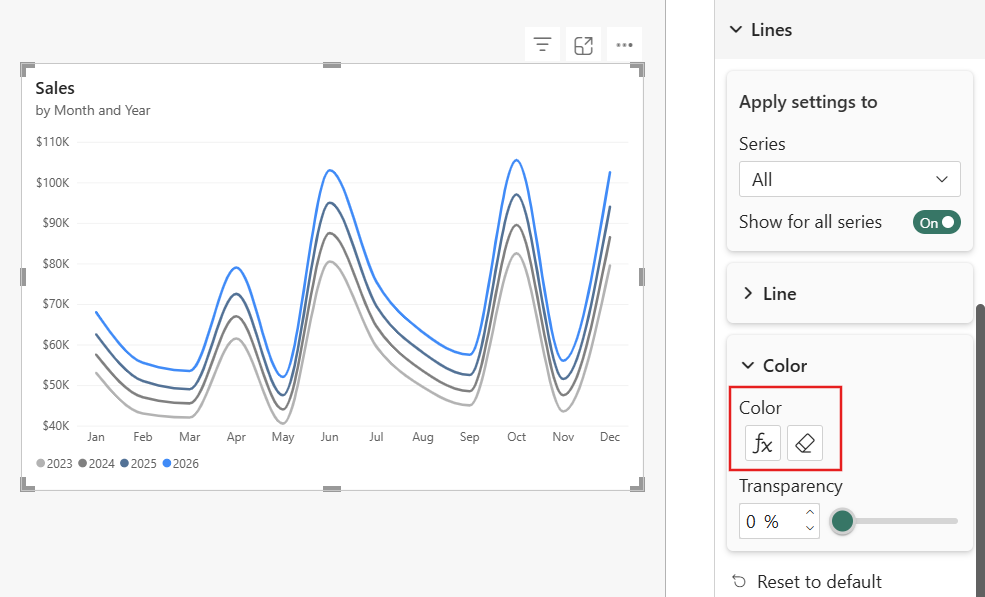
Use gradient colours to automatically emphasise the most recent year's performance while fading historical data into the background. The formatting updates automatically as new data is added, so your reports always highlight the latest results.
Use Case #2: Keep Legend Colours Consistent
Apply colours from a model field so every visual uses the same category colours throughout the report. This improves readability, reduces maintenance, and ensures new categories automatically inherit the correct colours.
Use Case #3: Pair Colours with Field Parameters
Assign colours to field parameters so each selected measure keeps its own visual identity across every report. As users switch metrics, the colours update automatically, making comparisons easier to follow.
Discover how Sport Wellington gained valuable insights into participant performance with intuitive Power BI visualisations. Read the case study and contact us to discuss your business intelligence needs.