
Power BI's Shape Map visual is now generally available, giving users a supported way to visualise data across custom geographic boundaries. The update introduces more flexibility for mapping regions, territories, and other location-based data while making geographic reporting easier to customise.
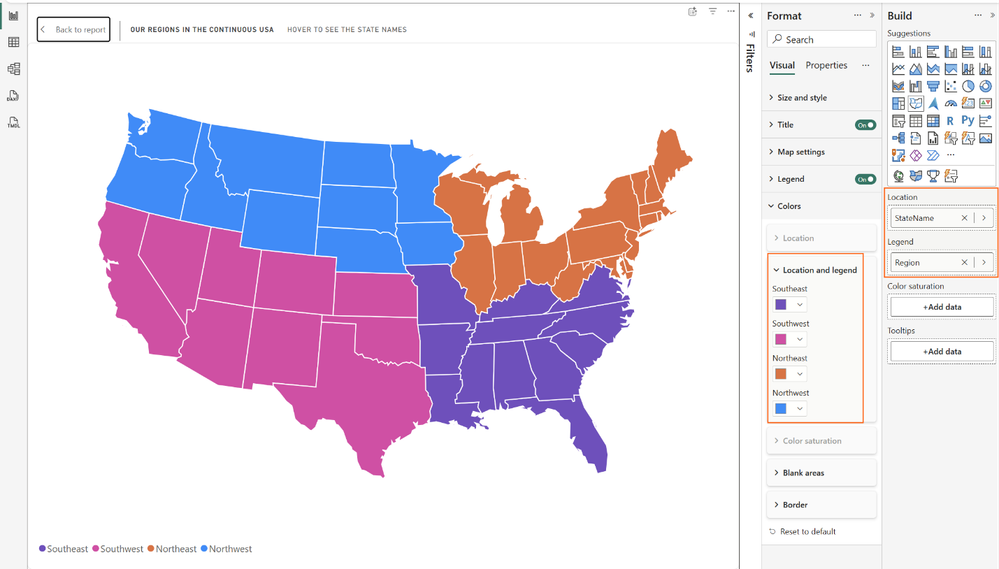
Here's what you need to know:
What is Shape Map?
Shape Map lets you display data using custom boundaries such as sales territories, franchise regions, or service areas instead of relying on standard maps. It helps you compare performance in the way your business is organised.
How do you add maps?
Choose from built-in maps, upload your own TopoJSON or GeoJSON files, or reference map files hosted online. This gives you the flexibility to use standard regions or create maps tailored to your organisation.
How do you format map colours?
Apply gradients, rules, field values, or category colours depending on how your Shape Map is configured. Power BI automatically shows only the formatting options relevant to your visual, making customisation much easier.
Use Case #1: Regional Performance
Group locations into business regions and assign consistent colours to each territory. This makes it easy to compare performance across sales, service, or operational regions at a glance.
Use Case #2: Store Coverage
Use colour saturation to highlight where your stores are located and how densely they are distributed. Darker regions can represent higher store counts, helping identify both strong coverage and expansion opportunities.
Take your reporting further with Power BI and our Business Intelligence expertise. Contact us today to learn how we can help your organisation get more from its data.