
Microsoft has refreshed its Power BI sample reports with modern visual defaults, bringing a cleaner and more consistent look to the examples users rely on for inspiration. The updated 2026 sample reports showcase the latest reporting experience while giving users a practical way to explore the changes in Power BI.
Here’s what you need to know:
Experience Stronger Semantic Models
What happens behind the visuals matters just as much as what you see on the report page. The refreshed samples demonstrate clearer naming, descriptions, measures, formatting, relationships, and reusable modelling patterns.
A More Modern Report Experience
The refreshed reports bring together a cleaner, more consistent design with updated visuals and improved navigation. They also introduce features such as larger canvases, mobile layouts, report page tooltips, the new card visual, date pickers, and button slicers.
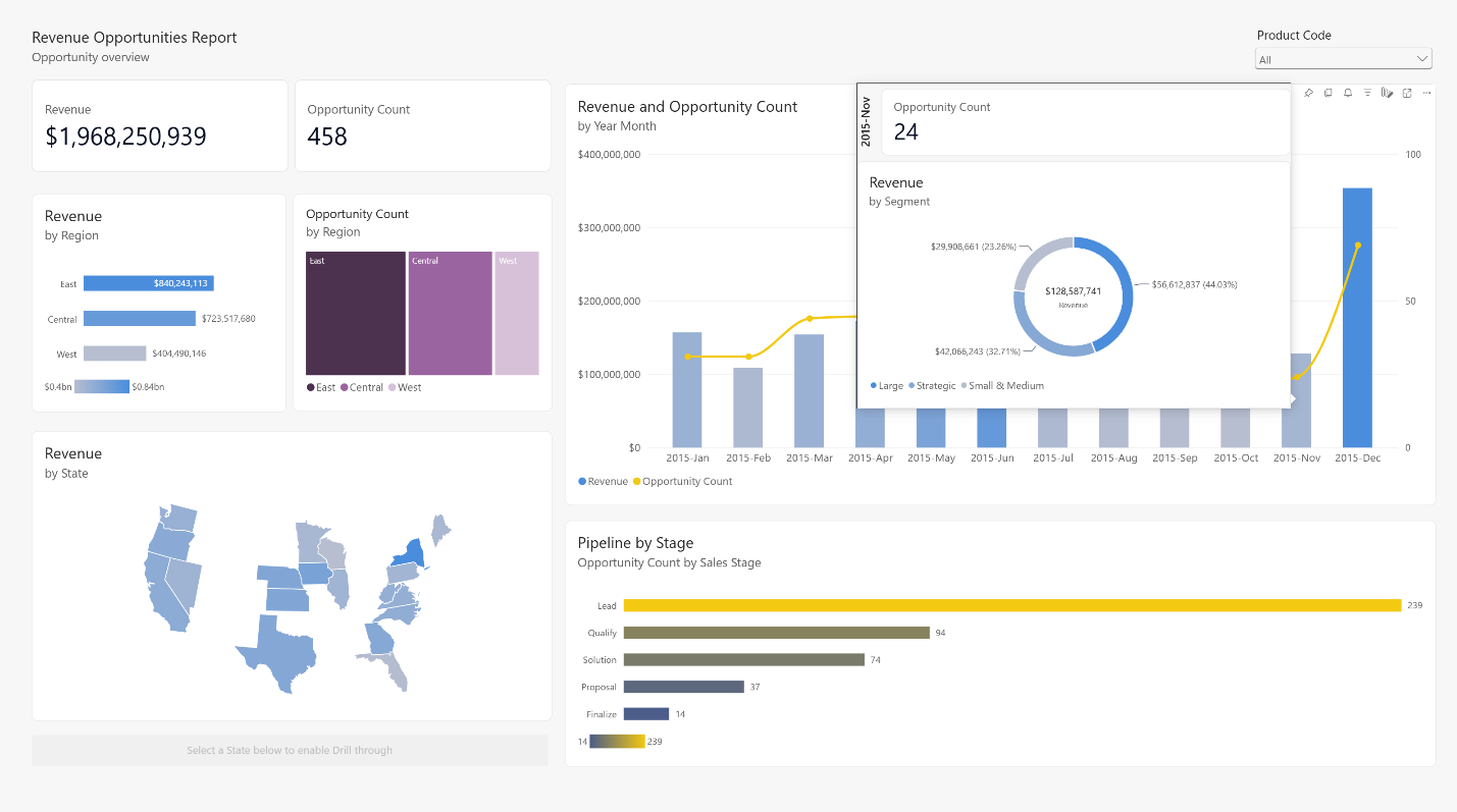
Refreshed Sample #1: Revenue Opportunities
Explore a revenue-pipeline report that combines a Shape Map, report page tooltip, and combo chart. Hover over data points to uncover additional context without leaving the page.
Refreshed Sample #2: Regional Sales
This sales report now takes advantage of the larger canvas, new card visual, page navigation, Shape Map, and improved table and matrix layouts for a more structured analysis experience.
Accelerate Your Own Refresh with AI
You can apply similar ideas to your own reports with Skills for Fabric and Copilot for Power BI. Use AI to explore your data, shape report content, and identify opportunities to modernise your reports—then bring in your own business context and design judgment.
Ready to Try the Refreshed Samples
Explore the updated reports, review their semantic models and mobile layouts, and discover design patterns you can adapt to your organisation.
Curious about what Power BI can do for your organisation? Explore our Independent Police Conduct Authority case study and get in touch with us to learn more.